When it comes to mixing ink, I rarely ever use the formulas given on the Pantone guide. I use the guide for inspiration or cues and go from there. I mix the colour until my eyes are happy with the results. Of course, when it comes to Pantone specific requirements for a job, I do pay closer attention to the parts/portions of inks. Because I don't have a scale for my inks, I have to guess. I'll take portions of ink by eye and smear the mixed colour on the same cardstock that I'll be printing on until it's just right. I've been known to take over an hour to get a 99% match for Pantone specific jobs. Other times, it's easier to do and I can get the match right away. Truth be told, I'll have a second pair of eyes (my husband's) to help me judge the colour I'm mixing if I'm having a particularly difficult time with it. I always mix in natural daylight (I prefer the bright cloudy days as opposed to sunny clear days) which explains why I like to print during the morning and afternoon. That was all just in case you were interested ;)
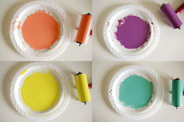
Here are four colours I mixed over the weekend for some upcoming seasonal prints...stay tuned. Spring is just around the corner!
//


No comments:
Post a Comment
Anonymous comments (meaning comments without valid URL's) will not be published.